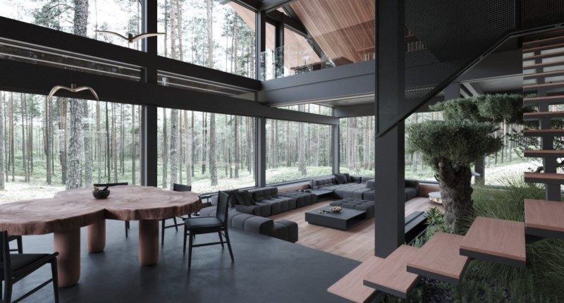
- Designed by Ukrainian architect Stephen Tsymbliuk
- A minimalist, tri-tone, symphony of black, grey, and wood tones
- Thoughtful design elements include strong constrasts
As I’m sure many of us do, we trawl social media, the pages of architectural magazines, and dream about that perfect home, not a house, a home.
Recently, I discovered a property by Ukrainian architect and designer Stephen Tsymbliuk’s, whose design could be the perfect portal to nature.
Minimalism
Curiously called Moscow House, the uncompromisingly minimalist design is perhaps best described neither as design nor architecture. It is also a frame through which one might admire the beauty of a forestry landscape.
When viewing the design more closely, it becomes clear that, like monochromatic photography, the fixation is not on the transient and distracting flourishes of colour, but the design is concerned with texture, form, and frames.
Bold and understated
The lines are clean, the overall house is perhaps described as serviceable, but there is a boldness in the strong, cutting, lines that unapologetically demarcate different areas within the home.

An element of wilderness is also brought inside – beyond the obvious floor to ceiling windows – by utilising unfinished, natural edges on the timber tabletops and shelves.

It is a juxtaposition that is carried throughout the home, the pool table is a bold centrepiece of one room, but surrounded by the rich tapestry of nature, introduced by double level windows.

Never too far from nature either, even the centre of the house is tastefully punctuated by a small garden, so too the first floor.

Dark but not oppressive
There seems only one real colour as such: black. The remaining two: grey and brown, are simply a reflection of the materials in a natural, unadorned state.
Stepping back from ironically over-analysing the minutiae of a clean simple design, the macro view again brings into focus strong contrasts, and quite literally so.

The ubiquity of the black tones from walls to bathrooms and bedrooms is balanced by overwhelming volumes of light and space.

Other areas such as the attic are thoughtfully considered: tighter, smaller spaces are very well lit and almost completely void any black colours, barring some clothes racks.

Thoughtful
Like balancing actual volumes and light, the design has quirks like a slide coming down from a mezzanine.
The slide sweeps at the same angle down as the roofline, another subtle but well-integrated feature.

Final words
I reckon this design could be perfectly suited for the beautiful South West Region of our golden state of Western Australia.
Through my journeys down south I have always imagined how homes like this would fit perfectly and carry forth our Australian themes with ease.


