- Was home to Subiaco institution: Witch's Cauldron
- Included a curated mix of over 50 commissioned art pieces
- Comprised two strong yet seemingly opposed themes: transformation and familiarity,
When approached by the new owner of this landmark site, Benson Studio saw the site and the moment in time for Subiaco as a unique opportunity to connect with the past and embrace the future.
Comparing the hospitality precinct of Subiaco to the diurnal cycle, with the days of long business lunches and Subiaco Oval as the mecca for 40,000-plus hungry and thirsty footy fans now things of the past, many might mistake Subiaco for being at dusk, with the long night ahead.
But transformation is starting, and it seems Subiaco is in the early hours of a brand-new morning.
A vibrant and proud history
Both the iconic Subiaco Markets and Oval sites have been razed with new landmark developments on the way, the Subi Hotel is under new ownership with a refurbishment planned.
Juanita’s, Lulu La Delizia and Fenway are just a few of the exciting prospects the area has to offer.
And, of course, succeeding the old Witch’s Cauldron restaurant: Dilly Dally.

By getting involved in the refurbishment of the building which housed a cultural cornerstone, just as the precinct was starting to find its new feet, architect Michael Benson and the Dilly Dally crew (general manager Patrick Ryan and sommelier Jeremy Prus) recognised the chance to increase the diversity of offering in Subiaco and to be a part of its evolution.
Bold and playful
Mr Bensons’s design intent for the refurbishment comprised two strong yet seemingly opposed themes: transformation and familiarity, with the resultant form walking the tightrope between the two.

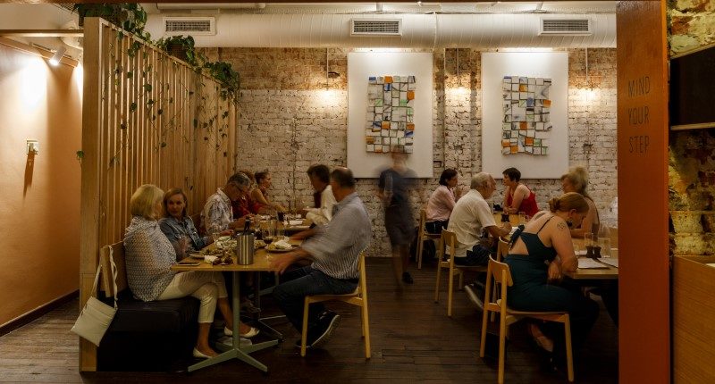
The transformation of the space is exquisite: the new façade creates a bold yet playful street presence with bright terracotta colours soaking the front elevation and splashed throughout the interior.
Lighting is a subtle yet intimate mix of floor lamps, recessed LED strips, wall-mounts and festoon lights. The furniture is a similarly charming blend of matching and mismatching secondhand pieces, offering seating options from long high bar tables to secluded corners for two.

Historical roots and references
Balanced against these changes is a respectful connection not only to the building’s preceding use, but to Subiaco itself – its heritage and community.
Mr Benson researched the original structure and façade during design, and deliberately ensured the new insertions remained respectful of what was there previously:
- The height of the new front windows replicate the old shop front; deep reveals in the windows (which can double as window seats) reference in plan the old planter boxes which used to sit on the street front; plaster has been pulled away to reveal the original brickwork;
- The original timber boards and concrete floors have been stripped back and partially sanded, but not sealed or polished, and
- Some parts of the kitchen and restrooms haven’t been touched by the refurbishment, still in impressive condition from decades of careful maintenance.
Nurturing connections to what was there previously also enabled another design goal to be achieved – the budget.
Michael has been delightfully thrifty, with clever consideration of what the structure, infrastructure and finishes needed to bring about the feeling of change.

Painted plywood is embedded where original floorboards were damaged, load-bearing walls have been retained where possible, and much of the extensive kitchen and bar infrastructure has been re-used.
Careful decisions and compromises both during design and construction have enabled a cost-effective realisation of the design intent.

The artwork for the project is a carefully curated mix of over 50 commissioned pieces, including a mural by local Aboriginal artist Jade Dolman depicting the Noongar significance of the area, and 3 artworks created in a collaboration between Michael Benson and David Spencer which are “all found objects from the demolition of the site”.
Some of the old restaurant’s brass wall lights remain, with bare globes replacing the opaque lamps; and thick black marks have deliberately been left over one wall where the original kitchen cooker would have been.

While the space is still evolving, like Subiaco itself, the design has certainly achieved a balance between transformation and familiarity with this charming, delightful insertion.
As Michael summarised: “The space isn’t the same, it’s totally different. But the connection to everything that went before is strong.”
~~
Written by Pip Smith. Photography by Jessica Wyld.
This story was originally published in The Architect magazine, an official publication of the Australian Institute of Architects. It has been edited for republication by The Property Tribune.
The Property Tribune thanks the Australian Institute of Architects for the opportunity to republish the work, and shine a light on Australian architecture.


